Chart Explains the Entire World Economy - mpc journal - hakim khatib
The word economy divided by country. The percentages are based on information provided by Howmuch.net © Chart: MPC Journal.

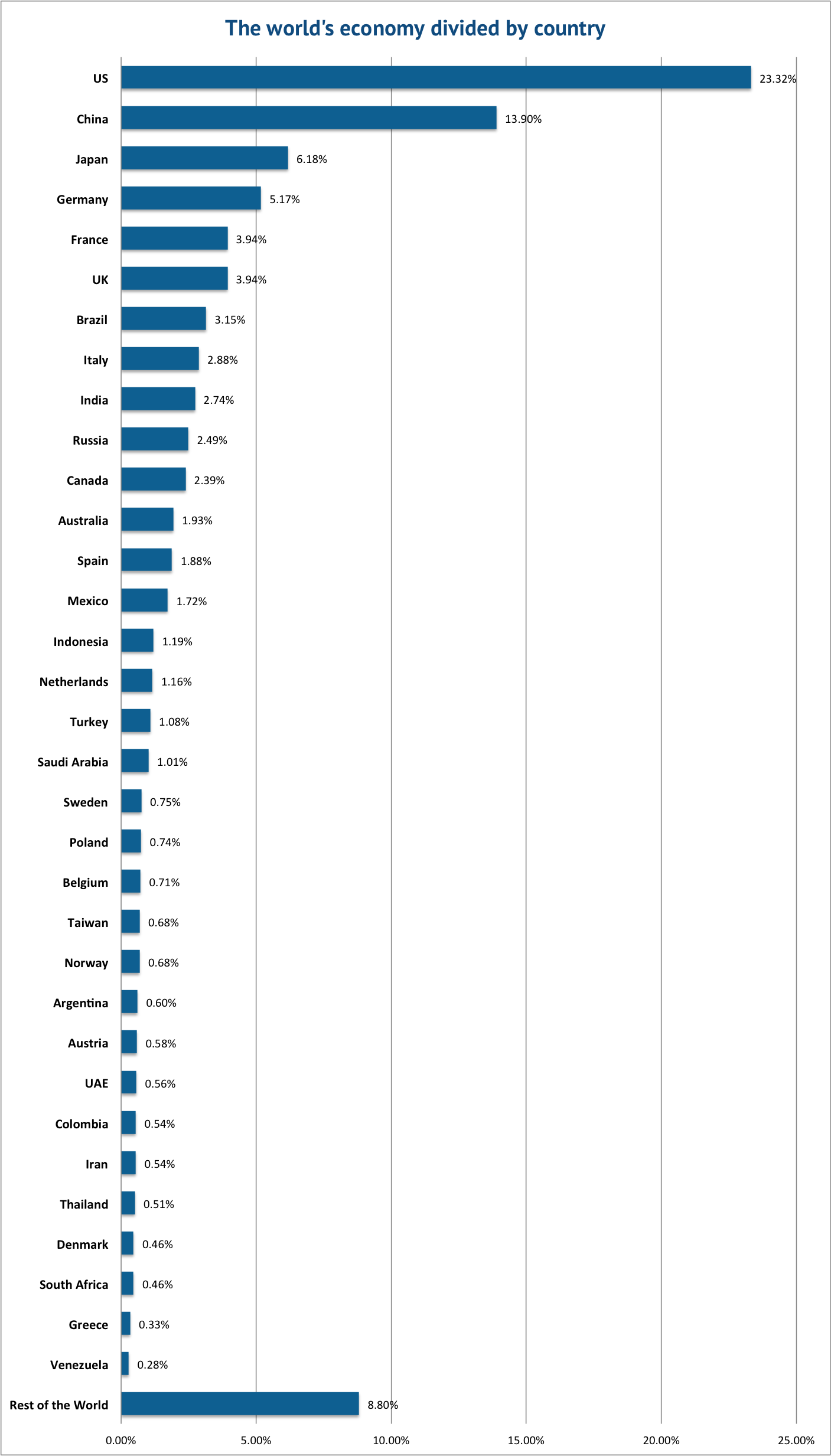
A map by HowMuch.net provides a perspective of the worldwide economy. The map represents each country relative to the size of its nominal gross domestic product.

The higher the percentage in the graphic above is, the larger the size of the economy. The percentages above are based on the map produced by HowMuch.net.

Chart Explains the Entire World Economy - mpc journal - hakim khatib
The graphic above (Voronoi diagram) represents the relative size of each country’s economy in terms of nominal GDP: the larger the area, the larger the size of the economy. The areas are further divided into three sectors: services, industrial, and agricultural. The US economy is mostly composed of companies engaged in providing services (79.7% compared to the global average of 63.6%), while agriculture and industry make up smaller-than-average of portions of the economy (1.12% and 19.1% compared to averages of 5.9% and 30.5%) – © Map: howmuch.net.

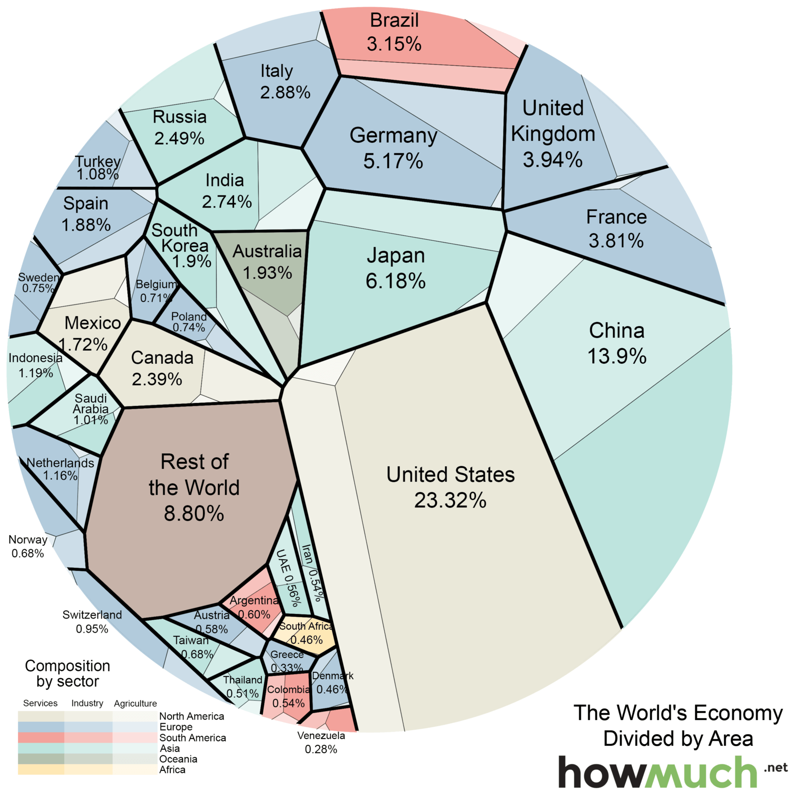
With a GDP upward of $17 trillion, the US comprises nearly a quarter of the world’s economy. This is slightly more the size of European countries’ economies combined.

Except for China, rich countries have service sectors that greatly outweigh both industry and agriculture.

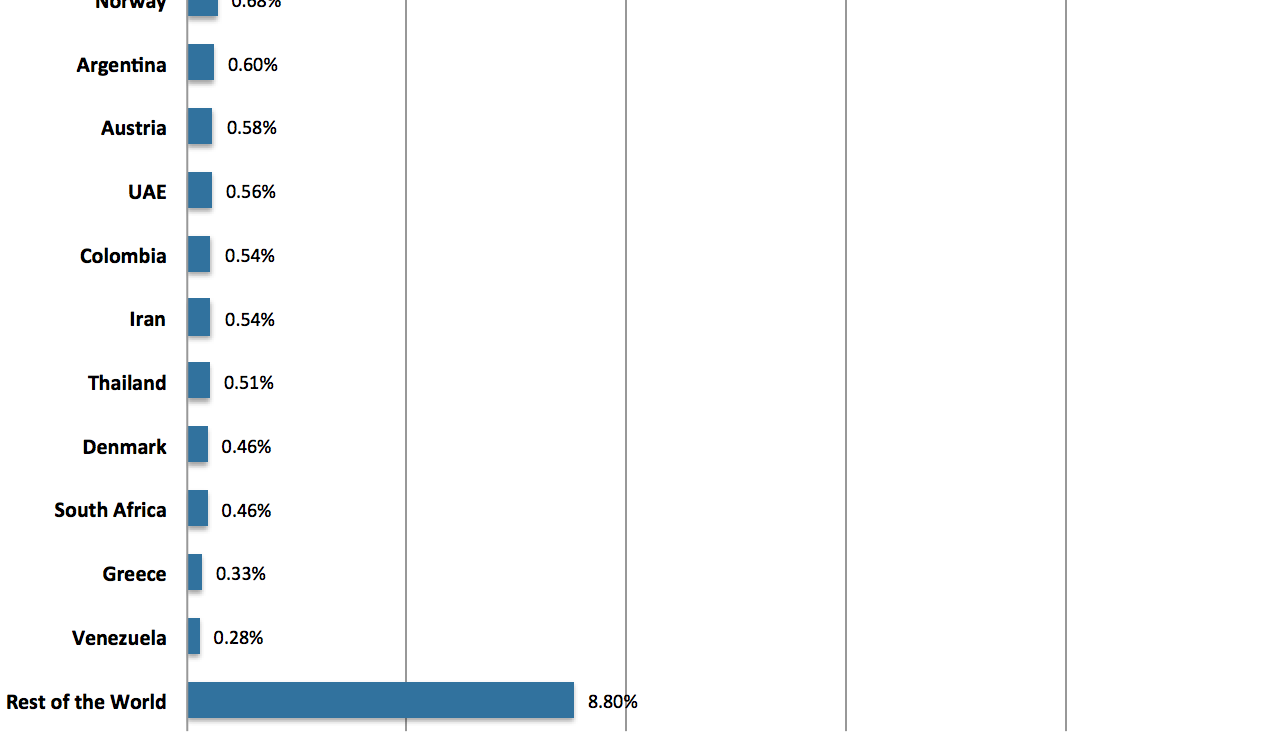
As for countries in the region of West Asia and North Africa, only Saudi Arabia, UAE and Iran are mentioned in the map (1,01% – 0,56 % – 0,54% respectively).

By MPC Journal Team

Middle East Politics and Culture Journal is an independent platform that provides reports and news on political affairs, security and defence, counterterrorism, and culture in the Middle East and North Africa.